The front cover of my digipak shows two colours green and black. I chose to use green and black as this was a theme which I was trying to use throughout the ancillary texts. I also felt that green was a colour of good nature, health/wealth and I believed that it would represent my artist in a more positive light. The black also added depth to the front cover and I felt that it would contrast with the green. I also add light green scratch effects to the cover of my digipak, to me I feel that it conveyed the rawness and realness of the music industry. And the urban feel that it tends to have, like when they use graffiti in their graphics. Furthermore, the typography of the album title looked like a stamp, it appears scuffed and old. Which again I feel appeals and follows the indie genre as the graphics tend to look rough and amateurish. To create a very edgy and rugged effect for the audience. The font is also bold but small, it stands out at you and grabs the audiences attention. The image used on the front cover was a close up of my artist I believe that this image created sympathy for the artist. As you could see his facial expressions and emotions, which will allow the audience to feel sorry for him or feel his seriousness. Which can also help imply that his album should also be taken seriously.

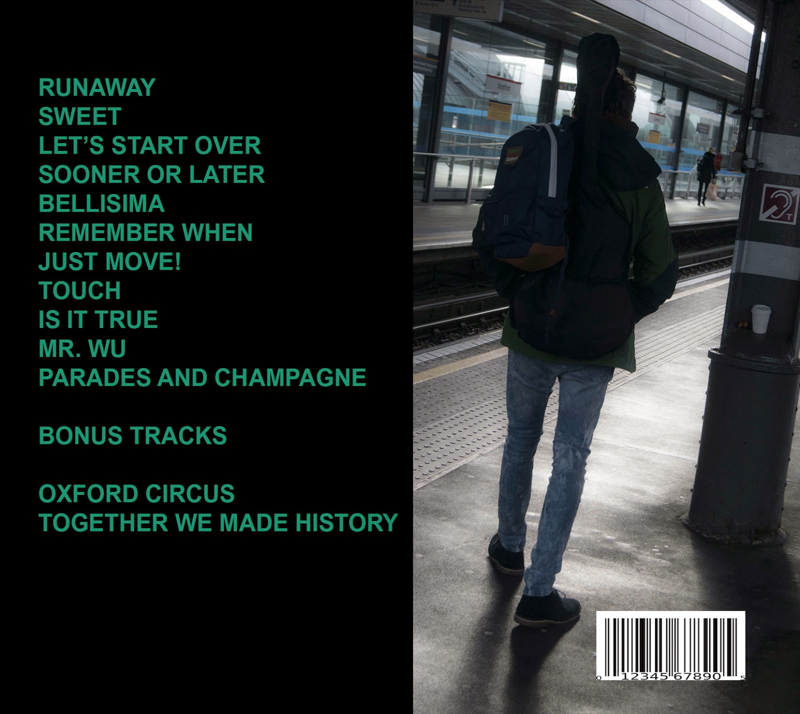
The back cover of my digipak also show a song list which is on the album and an image of the artist with a guitar on his back. The colour is also black which I feel ties in with the front cover. Furthermore, the image of the guitar on the artists back taken in a station I believe is very conventional as indie artists tend to use iconography such as guitars. It is also set in typical location, this gives the impression that the artist is a normal person, which can allow the audience to relate to him better. The dark colours such as black, represent the artist as edgy, dark and someone with depth. This can attract the audience to become more intrigued by the artist and believe that he is an interesting individual. The layout is very simple all the text is to the left, which can be easily read and understood by the audience. The typography is also in capitals and bold letters to show its importance.
The CD was a grayscale theme to fit in with the magazine advert. The CD is a collage of black and white images taken with the artists name written around the CD with a king logo besides it. The grayscale theme was conventional and added depth. The king logo emphasised that the album name was king, allowing the audience to not forget the artists new album and associate the crown symbol with my artist. I feel that collages definitely appeal to my young target audience and show creativity and uniqueness which are characteristics which I am trying to show that my artist has in order to give Nico a competitive advantage.
The inside of the album were also very straightforward and simple, to display realness. I didn't want to go over board with this design as I didn't want it to appear tacky. But the images placed in the inside album are exclusive and never been seen before which allow the audience to feel very special and important. The exclusive images show Nico on posing on a train in London, again the location is simple and casual allowing relatability for the audience and showing ho normal he is. It also features a signature and short message by Nico which explains why the album was made, what inspires him and what next. This allows the audience to feel like their apart of the artists movement so they will hopefully continue to support him.


You have provided a sound analysis of you individual digipak, explaining most of the elements used on each of the slides and what you hope they create. However, you have not completed the analysis of photoshop or included a conclusion.
ReplyDeleteYou need to:
1) Make sure you cover all bullet points for each of the slides
2) Make sure you fully explain what you hope each element will create and whether or not it is conventional of your chosen genre and why
3) Explain what tools you struggled to use on photoshop and why, as well as how you overcame this
4) Explain what you feel you used well on photoshop and why - what did you create?
5) Conclusion - overall, how do you feel your digipak appeals to your target audience and whether or not it is conventional of the genre; how will this assist you with your groups digipak?
6) Include a screen shot of your completed digipak