Research into music videos

Wednesday 17 December 2014

Rough cut - Miss Georgiou

  Audience feedback is essential to a production as it allows you to then enhance your work by taking on the criticisms which your audience identified, changing these criticisms into a strength. To  make sure it is even more suitable and fit for the audience to enjoy, to ensure that the final media product will be a success. It also allows you to know where you went well and what was most effective, this is good to know for the future and to know that your on the right track for production. A rough cut is vital, once we watch the rough cut and form a rough cut version it becomes easier to identify what elements of the music video and what shots work well or not. So we can then easily spot out these discrepancies and make these changes/improvements in our final cut. 
 We received audience feedback through questionnaire sheets along with a screening of the production. We also received feedback through the use of YouTube which allowed us to reach a wide audience as well as our target market.

Feedback/Questionnaire sheets after production screening 

 The positive comments we received were that we followed the indie conventions, good mise-en-scene and good time lapse. This was good to hear as it was something we aimed to do, to stay true to the indie genre through iconography such as plain clothing, guitar, isolated and eerie locations, its great that our audience picked up on the Mise-en-scene and felt that they felt it was indie as that was our aim. We were also told that the time lapse was very effective as it matched the visuals and lyrics. This is great as we aimed to follow Goodwins theory by making the visuals and lyrics/music match. The time lapse was used to add a jump in time and create more pace and edge, but show some more creativity and flare in our music video. 

Conventional - Guitar, plain clothing and a isolated eerie location

 The negative comments were that some of the footage is too dark, when performing only some of the footage was out (lip syncing and shots)and that the narrative was not very clear. During the beginning of our rough cut the filming outside was not very dark at the time, but the lighting was not picked up very well by the camera. This made our video fairly dark and not very easy to understand what was going on at the beginning of the music video. From this comment as a group we have decided to enhance the shots through final cut pro by using brightness/contrast tools to ensure that the audience can identify what is taking place in the shot. During some filming, we were pushed for time and had to quickly film, sometimes not filming enough takes of each lyrical line. When it came to editing we then realised that a lot of lip syncing does not exactly match the pace of the music and some footage was out due to us trying to fill in the gaps (filler shots). We are going to re-film some shots that we are disappointed with to ensure that everything synchronises properly. To make sure this does not happen again we will prepare enough time to get our lyrics lip-synced properly. Furthermore, the clarity of the narrative is not great and we realised that after the audience feedback sheets. We will now aim to add more performance shots and shots of a dad to emphasise why the artist has really runaway from home, which is the underlying theme of the music video. 
 This feedback has definitely let my group know what our target audience think of our music video. As we now know what we need to improve to be able to promote our atist effectively and satisfy/appeal to our audience. Also, we can identify now what we need to work on and plan out times when we can work on this. Carrying out these improvements will make our video more likely to gain more views, become more well known and be a success. I feel that for us to take this feedback serious and make these changes. Will let our audience know that we care about their needs which could make them feel special. It could also allow them to feel like they were apart of making this artist's music video - which could build their fan loyalty to Nico Johnson.

Rough Cut

YouTube Comments 


Monday 15 December 2014

Individual Digipak - Miss Miller

I designed an individual digipak to discover my own inspirations and ideas. This was also done so we can then feedback to the group our own ideas to then create a final improved design, which is more suitable to our design brief. It will allow us to see the strengths and weaknesses in our own designs and remove more of the weaknesses to make an excellent digipak. 

The front cover of my digipak shows two colours green and black. I chose to use green and black as this was a theme which I was trying to use throughout the ancillary texts. I also felt that green was a colour of good nature, health/wealth and I believed that it would represent my artist in a more positive light. The black also added depth to the front cover and I felt that it would contrast with the green. I also add light green scratch effects to the cover of my digipak, to me I feel that it conveyed the rawness and realness of the music industry. And the urban feel that it tends to have, like when they use graffiti in their graphics. Furthermore, the typography of the album title looked like a stamp, it appears scuffed and old. Which again I feel appeals and follows the indie genre as the graphics tend to look rough and amateurish. To create a very edgy and rugged effect for the audience. The font is also bold but small, it stands out at you and grabs the audiences attention. The image used on the front cover was a close up of my artist I believe that this image created sympathy for the artist. As you could see his facial expressions and emotions, which will allow the audience to feel sorry for him or feel his seriousness. Which can also help imply that his album should also be taken seriously. 


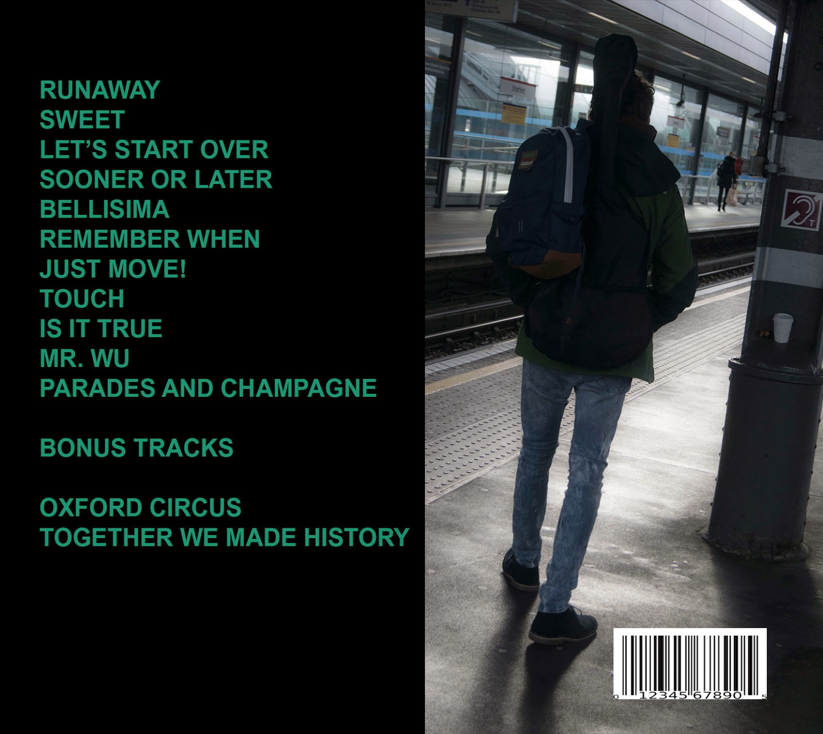
The back cover of my digipak also show a song list which is on the album and an image of the artist with a guitar on his back. The colour is also black which I feel ties in with the front cover. Furthermore, the image of the guitar on the artists back taken in a station I believe is very conventional as indie artists tend to use iconography such as guitars. It is also set in  typical location, this gives the impression that the artist is a normal person, which can allow the audience to relate to him better. The dark colours such as black, represent the artist as edgy, dark and someone with depth. This can attract the audience to become more intrigued by the artist and believe that he is an interesting individual. The layout is very simple all the text is to the left, which can be easily read and understood by the audience. The typography is also in capitals and bold letters to show its importance.


The CD was a grayscale theme to fit in with the magazine advert. The CD is a collage of black and white images taken with the artists name written around the CD with a king logo besides it. The grayscale theme was conventional and added depth. The king logo emphasised that the album name was king, allowing the audience to not forget the artists new album and associate the crown symbol with my artist. I feel that collages definitely appeal to my young target audience and show creativity and uniqueness which are characteristics which I am trying to show that my artist has in order to give Nico a competitive advantage.

The inside of the album were also very straightforward and simple, to display realness. I didn't want to go over board with this design as I didn't want it to appear tacky. But the images placed in the inside album are exclusive and never been seen before which allow the audience to feel very special and important. The exclusive images show Nico on posing on a train in London, again the location is simple and casual allowing relatability for the audience and showing ho normal he is. It also features a signature and short message by Nico which explains why the album was made, what inspires him and what next. This allows the audience to feel like their apart of the artists movement so they will hopefully continue to support him. 


Group magazine advert - Miss Miller

Final advert 

As a group we had a meeting during lesson where we displayed out individual magazine ideas to the group. Once we done this, we looked at the strongest design out of all our magazine adverts and felt that Amber's was the best designed. We then added aspects of the other individual magazine advert to enhance and develop the quality of the advert. For example, the font was changed, it now displays number one album and the colours are more vibrant these are adaptations which derived from Dominico, Robyn and my individual magazine advert. 


Amber's magazine was the design that we stuck to for our magazine advert. The picture below is Amber's individual magazine advert.

The colours and images in my magazines advert have changed. In my own individual advert the theme was black and white, rather dull. This has somewhat been mixed into the magazine advert with half of the poster being black and white and the other being more colourful. The black and white theme remained in the magazine advert as we felt that it was conventional to the indie genre and created mystery for the audience as well as depth for the artist. But in this group magazine advert it is also more vibrant and fun than my individual advert. I feel like this appeals to the young audience (15-25) we are aiming at as it displays boldness and fun through the use of bright colours like reds,greens and pinks. It has made my artist appear as an upbeat musician but also shows edge by displaying of the tattoo parlour. I feel like the mixture of the two colours juxtapose one another in an interesting way. Which I feel relates to the artists brand image and music style showing that Nico is both upbeat and happy but also deep and indie.

The images have also changed, in my own individual advert I used only one image of Nico Johnson. However the main Image displaying Nico is the same picture I used for my artist but with the background edited out. It still has the effect of displaying Nico Johnson as a self-efficient artist. As the picture displays him looking away from the camera appearing very humble and reticent as if the camera isn't even there. This can allow the audience to believe that the artists is innocent and doesn't care about the money or the game. Which can allow them to build more of a relationship with Nico as they feel that he's a good genuine person. It also promotes him well as it is showing his character to the audience and allowing them to understand him through his body language. Indie artists tend to not look into the camera to appear more raw, edgy and real to the audience so this is also conventional to the Indie genre. 

The image of the background tattoo and adult stores for the background show that the artist is mature and is edgy. This can allow the audience to view the artist as someone who is cool which can then make Nico to be viewed and considered as there role model. Which can lead to a more long term fan base which would definitely help increase sales for Nico's debut album. 

Another image used in this advert is the taxi's with Nico holding a guitar on his back. I felt like this was used to connote the fact that the artists lifestyle or life is moving very fast. In terms of his life situations and experiences which could relate to some of the deep songs like Runaway. As you can see it is taken on the street I feel like it will allow the audience to see that my artist is a normal person, strolling through the streets of London so they will be able to relate to Nico's lifestyle more. This can allow the audience to view the artist as someone like themselves. Allowing the artist to form a good representation of themselves helping Nico to be promoted in a positive light. Furthermore, this image is conventional as it displays Nico holding a guitar, autistic guitars are very natural and conventional in the indie genre.


Robyn's original magazine advert was very similar to the group magazine advert, it also used similar typography and the same image of the artist but with the original background.

The typography in this advert is very simple and plain compared to my own individual magazine advert. I much prefer the simple font as I feel that it displays Nico well as he is a very plain, easy going and simple character. I feel that the simplicity of the font really represent his brand and image. Indie artists tend to use normal font to represent how real they are. Also, the boldness of the font to me represents there confidence and strong talent. The font for Nico Johnson name I feel was similar to my own advert as it used overlapping font to show boldness, creativity and uniqueness, giving the artist an edge. For the audience this font and typography style will make him stand out from all the other music artists and give Nico a competitive advantage. Allowing his advert to be promoted effectively. 

The main language use in the advert is 'hit' this term is a British idiom used to describe when something is big or on top. This I feel targets the audience properly as the target audience are mainly British and Indie is much more popular in the UK. So I feel the market is targeted effectively through language terms. This was kept as we felt that it was the most appropriate term to describe that our artists album has been a success. 

The layout and design of the advert is very different, it has many pictures combined into one and many elements incorporated into it. I feel that it made our design very unique and unconventional which fits in with the indie genre. The text is in many different places on the design which I feel makes it more appealing to look it and more interesting. 

I feel that Domenico's design inspired the layout and design of our final advert through the interesting graphics, crown logo and imagery


Strengths and weaknesses

One weakness of my own advert is that my font did not show up so well on the grayscale background as the colour of the font just didn't stand out which would make it hard for the audience to read, however It looked very professional and clean through the use of the images of colour coding. But as mentioned, the font couldn't be identified easily.

Domenico's advert had great design and graphic potential but it was unfinished and lacked general details to inform the audience of what the advert was for, the album etc. But the colour scheme and logo of the king were great ideas.

Robyn's poster was nice and simple, following the grayscale scheme like my own. I feel that it was straight to the point and catchy. However, it maybe lacked too little information as it didn't show where you can buy the album or a website which the artist has. Therefore, if it was a real magazine advert the audience would not be able to keep up to date and in touch with the artist that easily as this information was not put down. But the design is snappy and easily understood. 

In conclusion, I feel that my advert does conform to the indie genre as it uses the grayscale theme, identifies indie iconography such as a guitar, the artist looks indie by wearing plan clothing and by looking away from the camera - portraying a reticent identity. These are all characteristics and conventions which a typical indie artist will display in their ancillary texts. I do feel that it appeals to the target audience in terms of age and interest. The age we aim to target is 15-25 year olds and I feel that by the design of the advert and the bright colours used it will appeal to the younger generation. Also, it satisfies our audience as it portrays an artist who is humble and reticent through Nico's relaxed, easy going body language in the image. This is what our audience of Indie lovers like to see. I felt that it was good working in a group to create this final advert as it allowed us to contribute more design ideas to make our advert appear more finished and flawless.

Individual magazine advert - Miss Miller

A magazine advert is used to promote the artist and their upcoming album. The use of the advert would create awareness and grab the audience's attention, which could hopefully increase sales for the album/single. It also helps the artist to reinforce a particular brand image to the audience, which can compliment or contrast with the artists music style. I created a magazine advert for my artist Nico Johnson, to promote his album and hit single Runaway to the audience, to persuade them to buy it. The magazine advert will also allow Nico to potentially reach more fans. Magazine adverts are vital as it helps to build up the artist into a brand which the target audience adore. The reason we made individual adverts before doing it as a group is so we can form our own ideas and designs, we will then feedback to the group all our individual different magazine advert designs to create an improved and better magazine advert and include group members great ideas/design into one advert.


Colours

The colours used for my advert were black and white (grayscale theme) with some hints of green. I chose to use black and white as I felt that it represents the dichotomy of good and evil which I feel could represent the artist as someone who is edgy but positive. Which could relate to his music, which is deep but light-hearted. Black and white appeals to our audience by displaying simplicity and a vintage, original feel to his image. This will allow the audience to view the artist as someone who is authentic as well as unconventional. This could be a unique selling point for the artist, as he is an indie artist. And the fans appreciate an indie artists uniqueness. This magazine advert appeals to what the target audience expect to see, it has also allowed the artist to be perceived as original, allowing him to be distinguished from all the other artists out there.

Green is another colour shown in the magazine advert, green is a colour of safety, correctness, nature, health and envy. In terms of my artist I used the colour green to send out a healthy, positive and environmentally friendly comforting message to the audience. I wanted it to portray my artist as someone of good nature and transfer calmness to the audience as green is a relaxing colour. This maintains a good image for the artist and keeps fans to admire the artist. This great identity portrayed to the audience could lead to the target audience buying the album, all down to these hidden colour signals. 

Conventions

My artist is in the indie genre, the indie genre carries many conventions, I chose to follow them. In my poster the first convention is the grayscale/black and white theme to display the artist. Indie artists tend to use grayscale to emphasise shadows and add depth to the image. It also reflects the emotions being portrayed by the music which is put out by the artist. It is heartfelt and meaningful and connects to our audiences emotions as the grayscale theme is plain but eyectching with a retro oldern day feel to it.

The artists positioning in the camera (body language and facial expressions) emphasise that the artist is self-effacient this is shown a lot in the indie genre. Sometimes, their identity is hidden to convey mystery and eddginess. It also portrays the artists as humble, not too fussed about their appearance but focus particulary on their musical expertise. It also allows the audiences to want to build a closer relationship with the artist and get to know them better due to this hidden identity. It also displays the artist as not self-centered or vain, but a person who is unpretentious which can allow the audience to like them even more. Even though indie artists tend to not want to give out a image, the self-effacient laid back one is a brand identity for the artist. It will promote my artist well as the musical content produced by the artist is with good intent and respectful relating to his image.

The pictures in the background of the advert also create an indie feel to the poster. The pictures are edgy, unkept and cool looking.

The clothing which the artist is wearing in the advert is plain and casual, this is commonly shown in the indie genre. As artists are portrayed to not be very fashionable but to be laid-back in their choices of clothing. It also allows my artist to be seen as someone who focuses more on their music than their appearance. This is also shown by the styling of my artists hair, its scruffy and allows him to be seen as an easy going guy which allows him to be relatable to the target audience and give my artist a humble cool image. 

Images used

Background is a collage of two pictures together, it is a combination of two pictures merged together, to extend the collage. The collage in the background emphasises the artist as being original and creative in an urban view. The picture also displays the artist as humble and reticent, keeping his thoughts and feelings to himself. Indie artists tend to be quite reserved and I feel that the positioning of his body language portrays him as someone who keeps himself to himself, allowing him to be perceived as mysterious. Which can allow the artist to attract more fans, as fans want to uncover this mystery which the artist portrays - allowing them to be continually interested in the artists true self.  

Typography and layout 

The font used is centered in the poster, this is done to show how important the text is and how important the album and single are. It puts more importance on the album itself than the artists appearance as you can identify that the artist is positioned on the right hand side while the text takes the attention from the audience. Furthermore, the text is very futuristic using upside down triangle type font is very unconventional which relates to the artists music style which is also unique. The font is all in capitals and bold lettering emphasising that the artists music and album is the focal point of the album. It also helps the text stay in the audiences minds, so it will become memorable to the audience. Which can allow the artist to potentially increase sales as it will become unforgetable. The overlapping of lettering which allows the poster to have more depth and a 3D effect, allowing the advert to be more visually appealing to the audience.
  The layout of the poster is landscape, I felt to do that to make the advert different from all other musical artists posters it also allowed me to make a more appealing and exclusive poster which relates to the album being exclusive and deluxe which can allow the fans and audience to feel special.

Language

The language used for the album is serious through the review stating that he is 'very talented, unique and memorable' but it is also easy going by the idiom 'watch out for' an idiom is a dustinct style or perculiar way of communicating with someone. Watch out for would formally mean 'to be on watch for the arrival or approach of someone or something'. So I feel that the term watch out for communicated with the audience as if they're was already a relationship/connection as it is informal. But the seriousness at the start of the quote displays the artists music as something serious which it is, the song Runaway also has a very serious tone and meaning.  

Strengths and weaknesses using photoshop


The weaknesses with using photoshop was that when we had to use the laptops to save the project towards the end of the lesson. It would sometimes take a very long time to respond and their would be a threat of losing our work. But I overcame this with the help of a ICT technician and by using a USB to back up my files in case it deleted or did not save, which reduced that threat. I also found it very hard to remove the background of an image and to rasterize some layers. But by using tutorials on the internet and doing further reading of how to use these tools definetley helped me. However, I was already familiar with many of the photoshop tools.

I also had strengths with using Photoshop, I felt that I could position text and images effectively with no issue and my creativity was not limited by this software as there was so much I could do and so many tools to use. I used tools such as the bucket tool, blur tool and filters (grayscale). It definetley helped me to create a successful advert as it allowed me to create layers, add images, design on them and adapt them which was not complex at all. This helped me to design a clean pprofessional poster.

To conclude, I do feel that my advert follows indie conventions as I used grayscale themes, followed the theme of making the artist appear as self-effacing and serious but also portrayed the artist as someone unconventional and isolated. I believe that these are characterstics which indie artists portray. They also tend to make the audience sympathise with them and I feel like by the positioning of the artists body language and facial expressions in the advert allow the audience to feel sorry for him and build that emotional connection with the audience. This is what I feel indie artists tend to do well. The target audience for my artist is 15-25 and I believe that the poster appears to be youthful and exciting by the use of language and collages in the background, it definetley appeals to the target market through these elements.
  Furthermore, by this individual magazine advert I feel that when we come together as a group to share our individual ideas it will allow us to have an overflow of design options allowing us to be even more creative with our advert and perform a clean and great advert to promote our artist. As all our opinions will be involved allowing us to identify the faults in what we have produced and perfect it.

Wednesday 3 December 2014

Censorship - Miss Miller


  1. Censorship is the suppression of speech, public communication or other information which may be considered objectionable, harmful, sensitive, politically incorrect or inconvenient as determined by governments, media outlets, authorities or other such entities. - Wikipedia 

    Censorship is used on a music video or the lyrics that an artist is singing or rapping in there song. It is used to block out, cover up these things to keep it hidden from the audience. Due to explicit visuals or explicit language. Which may be inappropriate for some viewers for example, young viewers. 

Ofcom are the office of communications it regulates broadcasting and telecommunications that are given to audiences. It is government approved. It has rules that TV/music channels should follow and deals with the complaints. 

Examples of censored music videos:

Eminem's music lyrics would be censored on the public clean version due to swear words/explicit lyrics. 

Rihanna's 2011 number 1 song We Found Love. The video featured scenes of Rihanna and an impersonation of her ex Chris Brown getting steamy, taking each others clothes off, Rihanna throwing up on the street, pills and drugs being scattered on the screen, Rihanna and her boyfriend fighting, so this resulted in MTV censoring parts and French authorities banning the video to be shown on T.V in France before 10pm.

In 2012, Rita Ora's "How We Do (Party)" was censored, having the words "Drunk sex", "shot of Jack", and "smoking" silenced from the audio, supplementing the removal of the usual profanities.

PARENTS FOR:

Parents for censorship agree with it because it protects their child from being influenced by these mature music videos. They feel as though these mature and explicit music videos can influence their child's behaviour and cause them to be introduced to topics such as sex, drugs, alcohol, death etc too early. They feel that things they themselves wanted to teach their children in time. Are nowadays being introduced to their children by music artists/music videos in a more positive light. Censoring music videos protect a child from issues that do not yet concern them. It also means parents don't have to worry about what there child is watching as it will be censored anyway.

PARENTS AGAINST:

However, many parents are against censorship as they feel that censorship restricts a child's knowledge. These parents have a more relaxed view on explicit music videos. Believing that their child will be introduced to this sooner or later from peers or some other form of media. Parents against censorship feel that there child will have to choose for themselves whether they want to listen to that type of music sooner or later. They believe that no censorship allows a child to be more mature and decide whether they like that music for themselves. It's just down to the parents to teach the child between wrong and right. Also they feel that censorship is limited anyway and a child can make out what's been censored, making them curious about what was initially there before being censored. 

Artists: 

Many artists would not be happy to be censored. As it can stop them from expressing themselves fully as swear words help to emphasise pain and anger in music. With that being censored may not get the mood and expression across to the audience as well. And it may mean that the artist has to release a clean version replacing the explicit words. But being censored is good as it allows the artist to be more globalised and gain more fans. As it allows them to reach many audiences. It allows them to be positive inspirational role models to their audience especially young audience. Which could be good for their sales and profitability. 

Fans:

Fans would not be so happy with censorship as they would want to see the full artist. With no cover ups. Wanting to see the full artist and everything explicit. So they don't miss out on anything of the artists. And feel like censorship removes a part of the song, therefore removing the artists general message that they were trying to put across through there lyrical creativity and visual creativity. 
Record label:

The record label will agree with censorship as it will mean that they don't recieve negative publicity surrounded around their company and artist. Which could cause them to lose sales. But the record label can sometimes support there artist to not have censorship and therefore not like sensor ship. As it stops the artist being a true individual, being creative and not conforming to societies expectations. And just doing what's true to themselves. As record labels promote individuality. 

British music channels wl appreciate censorship. As obscene visuals and lyrics shown on their channels may cause them to lose views. This would apply to a music channel like MTV as they are very reputable and have a high expectation to live up to with that they show the viewers. As they have a very wide target audience they have to be mindful of what they show. And censorship allows globalisation, so everyone can watch it. Allowing MTV to keep their views high and remain profitable. 
 However, a music channel such as Channel AKA is a niche music Channel. Showing mainly R&B/Rap/Hip-hop music videos. So censorship may not mean as much to them as there music channel is urban. And I feel that they would like the full music video without censorship so they artist can be expressed better to the audience. And so it gives off that urban feel that channel aka aims to do.

British Radio Stations – BBC Radio 1/Capital Xtra I feel would be for censorship. As radio stations are heard by many many ears. So censorship will protect them from playing any music that is not suitable for an audience e.g young people. Which keeps them reputable and trustworthy in the future. As an in censored song played on their radio station could have a negative reputation on the radio station as a whole. Associating the radio station with explicit music. 

To conclude, the main belief on censorship of artists is that it should be done in order to protect certain audiences from being revealed to obscenity.

I believe that music videos should be censored. As a censored video has more positives than negatives and I feel people would all be satisfied as the music is appropriate.  Having younger siblings myself I wouldn't want them to come across an explicit video causing them to change their behaviour and influence their actions. I'd prefer for that to be hidden to keep them protected through their tender ages where their minds are influenced by negative and positive things. 

Also it can confuse some young viewers if they have been already taught that these things are wrong. But they are in front of their face and ears wih little choice - it can confuse their morals and beliefs that they've been socialised into.

In my own music video, I will not censor anything explicit. As my music video will not be shown to younger viewers. But will only be seen by people 17 and above. So I feel that there is not a need to censor the video.

Sunday 16 November 2014

Photoshoot - Miss Miller

Pictures are vital to take for an artist. Pictures are used for the artists promotional side such as magazine adverts, digipaks, merchandise, posters and more. Photos of the artist compliment the product or promotional item being viewed by the audience. They allow an artist to be identified and portrayed as a brand. It can be the underlying reason why a fan enjoys the artists music, as a picture shows an artists clothing style and image. When it came to filming I was the photographer, taking photos every step of the way. It was important to take many pictures so we would have much more choice to choose what we want to put on our artists digipak and film advert. As my group will all create individual magazine adverts and digipak ideas first. It was important to make sure that we all have different ideas initially. So we have a greater unconventional artistic edge for our groups digipak and advert.


A close up was taken for the main aim of using it as the digipak album cover. As a group we felt that the artist looking directly into the camera, allowed the audience to build a relationship with them as it looked as if the artist was looking straight back at the audience. This can make the audience feel special as the eye contact is very direct. The image can be argued to be conventional as the artist is looking straight as the camera with confidence and not giving off a self-effacing image. However, I believe that it is conventional by the artists image, the artist has unkept cool edgy hair and a laidback look on his face. While his clothing remains simple and basic which all ties into the indie genre artist representation. This could allow the audience to view my artist as a cool, edgy and unconventional, which could lead them purchasing his new album 'Heaven on earth'. I really admire this picture not only because of the laid back facial expression and conventional look the artist has. But also because of the background and scenery, if you look close you can see the London eye and buildings, this gives an identity to the location showing that its in London. Which also heightens the indie feel to the image as London has a very big indie scene.


This picture emphasises that the artist is travelling somewhere in London. By the location being the London underground tubes, it displays the artist as a regular person who still uses public transport despite his wealth and fame. This can cause the audience to believe that the artist is a lot like themselves, which could persuade them to view and listen to the artists music or maybe even purchase the digipak. This picture would most likely be used for the digipak as this type of scenery will be shown in the music video this image would be used as a behind the scenes type picture. Which is suitable for a indie digipak. I took this picture as I felt that an image of the artist looking away would make him look very professional and indie like. I feel that it is conventional through the artist appearing very relaxed, playing his guitar which is typical to see from a indie artist. I edited all images on photoshop, however, for this image I put shadows on the other passengers on the tube. I did this to display the location as more secluded and mysterious. I'm happy with this picture as I feel that my artist comes across to the audience as a musician in the indie genre and the positioning of his body and shadows create a very artistic powerful representation.


This picture was taken as I spotted a really artistic black and white background and felt that it would be a great image for us to take to be put on our digipak or advert. However, I have made this picture the picture to my magazine advert. As I feel that it looks very artistic and old fashioned. The collage of pictures itself were black and white and look scruffy but very creative. I then made the artist black and white to fade in with the background and almost look as if he is a part of the artistic collage on the wall. This image is conventional to the indie genre mainly because of the black and white grayscale which is commonly used by indie artists to display simplicity, authenticity and to display that something is old fashioned. I really love this picture, infact its my favourite of all the images. I feel that the positioning of the artist against the background posters is just epic. The head of the artist facing the ground at a side profile looks almost as if the artists inner mind is creative and portrays the artist as serious. This will allow the audience to be drawn to the artist due to his creative portrayal by the picture.


These two pictures are also some of my favourites taken on the day of filming. One of my group members spotted the indie packed location and a quick picture was taken. I love this picture as it is bright through the lights of the tattoo parlour but contrasts with the run down look of the buildings. This contrast can also relate to the artist as sweet, young but edgy, letting the audience understand who the artist is. These two images in my view appeal to older people in the ages of 18+ as you can identify in the image that their is a mature, adult only shop and tattoo parlour it appeals to part of our target audience. For the audience this will allow them to view the artist as edgy and cool, willing to take risks by taking a picture of these shops. It can help the artist be seen in a cool role model light, which can build the artists fan base and brand perception. This image would be used in my digipak as I feel that it gives an objectified representation of my artist which is something I feel fans would cherish more if it was in a digipak what you buy rather than a magazine advert which is in a way free of charge. It is definitely conventional to the indie genre as the location looks dingy, in a backstreet with a couple bright lights, which somehow gives off Indie characteristics.


I took this picture when we were leaving the train station, I wanted our artist to be positioned outside this small room in the station, a help point. This help point in the background will connote that the artist is in need for help, which relates to the meaning of the song from runaway. The artist is also carrying many heavy items such as a backpack and a guitar this was shown by taking a picture of his back, this conveyed how the artist has a lot of baggage and is serious about running away. The positioning of the artist in the camera looks like he doesn't have any sense of direction as he is walking diagonally while the by passers are walking ahead in a straight line. This can portray the artist as lost and confused, allowing the audience to sympathise with the artist. I intend to use this photo in my digipak, I feel the message it sends out is very strong and shouldn't be covered with text but should be solely displayed in the digipak album. It is conventional to the indie genre as it is set in a low-key location which is typical in the indie genre as it creates mystery and impact for the audience·
Artists also tend to be plainly dressed, playing the instrument of a guitar. 


Lastly, the orange/brown telephone box (this was edited via photoshop). I took this image to signify London and to reinforce to the audience that the artist originates from London and has a British culture. I didn't intend to edit the telephone box upon taking the picture, but after playing around with effects I felt that changing the colour of the telephone box could convey a strong message from the artist to the audience. The message is that London isn't what you think it is, its not all bright, its not what you expect it to be, its a faux. I felt like I transmitted that message by changing something so sentimental to the British image.  To take the evaluation further I feel that it represents gold, wealth and royalty, the crown on the telephone box represents royalty, the telephone box looks like a bar of gold while the bikes in the background convey a carriage, in relation to royalty. With the door of the telephone box shut, I feel that it shows that the artist is separated from the lavish lifestyle and wealth, and doesn't admire it. For the audience this will allow them to feel that the artist is down to earth, original and different, which could increase their loyalty to the artist and their artistic movement. I intend to use this image in my digipak. I feel that it is conventional as indie artists tend to show their perspective on important issues, in a non-condescending way. While showing that they have little care for wealth. So I feel that my artist also conveyed this successfully.

To conclude, I really enjoyed taking the pictures for my group and editing them. I feel that the photography allowed me to see everything in London artistically and create an artistic still image for the artist. I feel that I spotted great locations well and photographed the artist, objects and scenery to a good standard to convey a message. I think I may of struggled with using the settings as sometimes the camera would blur and I didn't know how to remove the blur and get the camera to be consistent and focus. However, despite many blurry images taken I still ended up gaining many pictures for my artist. The representation these images give my artist is a self-effacing, laidback and edgy one which is very conventional to the indie genre. As individual members of a group we will formulate individual magazine adverts an digipaks. We will all receive the images and then design to what we feel looks good and conventional. We will then come together and pick out what we admire and do not like in each members individual digipak and advert. This will allow us to merge each members ideas into a group advert and digipak. So all our creativity will be involved in the designing of a successful album and advert.

Saturday 15 November 2014

Risk assessment - Miss Georgiou

It is very important to consider the risks before filming to find out what we should avoid and how to ensure that each member of our group will be as safe as possible. Identifying these risks will help to provide rules, for example, to hold the tripod tightly, while closed to prevent it hurting anyone or even breaking. Considering the risks also shows what could happen ad how to reduce the risk. 

When filming I would constantly be on the look out to know if we are in contact with any risks, to ensure that each of us is safe. In an encounter with one of these hazards I would inform my member quickly to remove them before the hazard has become a problem for any of us 


Filming schedule - Miss Georgiou


A filming schedule is important to have as it helps you to formulate a plan on times and dates of when you should film. Its a great way to use your time efficiently to produce a good music video, it also reminds you of all the props you need to bring to shoot the video so it allows you to have your ideas written down bit by bit to complete your overall production vision. This stops you from being overwhelmed and going out to film without having all the equipment necessary and not knowing what your doing. Therefore, a shooting schedule allows the group to work more efficiently and become more organised.

When filming we did follow the dates and times an lists of our schooting schedule. No changes were made, but they made be made in due time once e figure out if we have shot enough scenes and shots. However, as a group we did struggle to know what content we were specifically filming each time we met up. We then had to plan on the spot and improvise sometimes, also timings on the schedule were not always accurate but that was not a problem.


Planning magazine advert - Miss Miller

A magazine advert serves the purpose of promoting an artists upcoming album and single. The promotion is done in order to raise awareness to the artists new music, with hopes in increasing their sales revenue. However, it isn't put in place to just increase sales but to also increase the artists brand image and fan base. Website addresses and social media information of the artist is shown on a magazine advert, to allow the audience to explore the artist further and keep up with them. Which improves there fan base and identity as an artist, which can then lead to an increase in sales. Magazine adverts are effective as they are placed in a magazine targeted at the right target audience, so readers are more likely to already be fans of the artist in the advert or have similar musical interests, for example, Q magazine aims their content to people who enjoy indie music. Therefore, if an indie artist was to put their advert in Q magazine it would be more likely to gain some extra fans for the artist than if the advert was put in a hip-hop magazine. A magazine advert is also very short and brief, making it quick and easy for the audience /reader to know who the magazine advert is for, what new album they have out and where they can buy it. This makes it very convenient for the audience and beneficial for the institution and artist.

I will be creating my own magazine advert to promote the album 'Heaven on earth' for my artist Nico Johnson. The advert will contain brief information and graphics to inform and appeal to the target audience which is 15-25 year olds. Planning is very important in terms of a magazine advert, as it allows you to form a basic idea and simple draft of what you have in mind for your magazine advert. Planning also allows you to be less inclined to make silly mistakes for example, album name on the magazine advert. It keeps you organised and reminds you of what to design and create next, allowing you to follow a vision which has already been drawn out. 

Colours

My magazine advert will follow a gray scale, black and white theme in order to convey the artist as authentic and simple. Black and white offers a high contrast, in Western culture black and white traditionally symbolizes good and evil, light and darkness and day and night. For a magazine advert black and white shows an insight into the artists mind an
d music style. For my advert, it conveys Nico as a simple guy with depth in his music as the black and white contrast look more serious. Which will allow the audience to take the artists music more seriously and build a connection with the artist.


Conventions of genre

The indie genre tends to use black and white images and effects, this gives an old fashioned, classical feel which creates a sad feeling to the audience. This allows the audience to be emotionally connected to the advert and to be persuaded to buy Nico Johnson's album. 
 It is also conventional that a picture taken in a isolated background and setting will be used. It creates mystery and a cool edgy identity as parts of the artist are hidden by the location appearing dark, gloomy and unidentified. It also allows the audience to focus more on the artists music on offer, rather than their fashion and physical appearance. As indie artists tend to be self-effacing, this will allow me to stay conventional to the indie genre. By using an image on the advert which is in an unidentified, edgy location with the artist wearing casual clothing and not looking into the camera, Sticks to indie conventions and allows the audience to be able to relate with the artist. 

Images used

The images used for my magazine advert will help portray my artist as humble and relatable. As mentioned above clothing, lighting and setting (mise-en-scene) of the image will help give a perception of my artist to their target audience. However, I will use simple, plain clothing to show that my artist is not superficial but is more emotional and deep. The lighting of the image will be low-key and have a lot of contrast to relate to the inner mind of my artist. Which is intense and heavy, transferring raw lyrics and music to the artist which can relate to the audiences circumstances and situations. For example, Runaway talks about problems at home involving family and parents.


Layout/design


The design and layout of my magazine advert will be landscape and text will be centred in the magazine advert. The text will be centred in order to show that it is important and the main focus of the magazine advert. It will be made landscape to show all the graphics in the photo, I feel that it would also look very different and unconventional, which is what indie artists aim to be, unconventional. This will make the advert stand out to the audience as it will look different and alternative, allowing them to be drawn to the advert and persuaded to buy their music. As the artist will be created for their indifference and creativity.


Typography

I aim to use a range of texts which come together well, the typography will reflect the indie genre and produce connotations for the artist. Larger and bolder typography will be used for the artists name on the advert so it will gain attention from the audience. Typography will look old, rustic, grungey and futuristic to contrast with the artists music style. It will display my artist graphically and more visually artistic.

Language

The style of language will be written in British dialect. For example, new 'hit' or 'smashing' these words are associated with the British language. It will help to appeal with my target audience as the target audience for my artist is British, so the advert will be promoted effectively. It will also allow my artist to be represented as someone connected with their roots and a talent from the UK. This can increase loyalty to the artist, for example, finding out an artist is British may encourage a British audience and society to stand by and support the artist. Therefore, this language draws attention to the artists nationality and background which can increase loyalty to the artists brand and image.

I found this plan very useful in generating ideas for my magazine advert. It allowed me to find out what different elements and techniques a magazine advert connotes, in relation to the indie genre. This made me more mindful of what to include in my magazine advert, for example, font style. As it can have a deeper meaning of the advert and can transmit to an audience subconscious views and perceptions of my artist, especially as the artist is new.

Thursday 13 November 2014

Music video storyboards - Miss Georgiou

A storyboard is a plan used to show each frame and shot we aim to take for our music video. The storyboard includes timings and descriptions with a simple sketch of what visual image I would like to display for each shot. The storyboards allowed us to know the order in which these shots would be taken, and to know what to film when it came down to production. It allowed us to remain organised when we film and to follow a guideline so we do not forget to film anything. 

The primary and secondary research allowed us to be more knowledgeable about our target audiences tastes and opinions (questionnaire/voxpops). But it also allowed us to become inspired from some music videos (research into music genres) and explore some of the successful techniques used in their music videos to then put in our own. Overall, It allowed me to  know what appeals to my target audience. Therefore when it came to planning I knew what to include, what conventions and different micro elements to display. As I knew what was tasteful to my audience and what entertained them due to my initial primary and secondary research. 

During lesson time we would come together as a group and talk about all our ideas and agree on a narrative. Then we split up the storyboard sheets equally and everyone had to work on their part of the storyboards. During this stage communication was very important. So we communicated through this process to ensure that we all agree with each members storyboards, cinematography used etc. 

Since filming part of our music video we have failed to follow our storyboards properly. But we have still gone with the same concept in the same location. However, not to the exact order and plan of the storyboards. We have made changes to how long a shot will be. How the shot will transition to the next one and so on. However, we still look at our storyboards as a basic guideline, but we are not restricted by it.